Prussian blue in ukiyo-e raises a question that a photograph alone cannot answer: are we describing a pigment, a palette, or a style of print? Museum research shows that Japanese printers could combine blue materials, while blue-centered compositions developed their own visual character. Understanding the difference helps collectors describe what they see without assuming that every blue passage has the same material or meaning.
Explore our Ukiyo-e collection.
Blue in a Japanese print can refer to several different things: the coloring material, the appearance of the whole image, or the way a printer varied its tones. Keeping these separate makes descriptions more useful. The National Museum of Asian Art explains that Japanese printmakers used plant-derived blues, including indigo and dayflower, as well as Prussian blue, a synthetic coloring material. Blue alone therefore does not identify one particular pigment.
Prussian blue and indigo are not interchangeable names. One describes a synthetic material; the other can describe a plant-derived colorant. Nor does a strong blue area necessarily mean that only one coloring material was used. Museum research offers a particularly clear example of this distinction.
In its study of The Great Wave, the Metropolitan Museum of Art reports that printers combined Prussian blue and indigo. Spectroscopic examination identified a mixture in the dark outlines. The printers then applied Prussian blue over an already printed passage to produce a deeper blue while retaining its intensity. The resulting contrast came from decisions about materials and repeated printing, rather than simply choosing a darker pigment.
That finding concerns a documented print and a studied printing process. It should not be turned into a recipe assumed for every Hokusai impression, every blue landscape, or every work by another artist. For collectors, its value is that it reveals how the printer helped shape the finished image. A familiar composition can reward close attention to its outlines, printed areas, and the relationship between lighter and darker blues.
The Smithsonian’s discussion of Thirty-six Views of Mount Fuji likewise emphasizes how the new synthetic pigment expanded the available range of blues. Its account connects those hues and values with Hokusai’s depictions of water, sky, and light before dawn. Blue could become an organizing element of a composition, rather than merely the local color of one object.
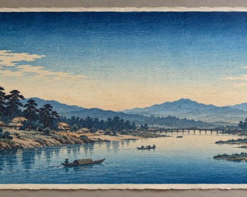
Aizuri-e describes a blue-centered approach to Japanese woodblock printing. It is useful to distinguish that description of the image from a claim about the precise chemistry of all its inks. A blue-dominated composition and a named pigment answer different questions: what the print looks like, and what materials produced it.
The Met’s discussion of Hiroshige II’s View of Iris Gardens at Horikiri, dated 1861, illustrates another distinction. It describes a semi-aizuri example with small touches of pink, alongside the earlier fashion for pure blue prints. The museum associates the blues with the nighttime scene and with coolness in a fan design. An image can therefore remain strongly centered on blue while including another color.
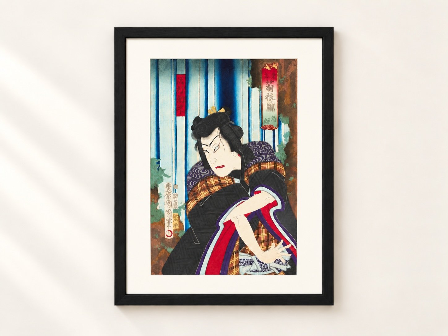
When using the term, describe the actual color arrangement. Does blue carry most of the image? Are there small accents elsewhere, or several substantial areas of other colors? A blue waterfall within a richly colored actor print is a different visual arrangement from an image organized almost entirely around blue.
Bokashi concerns graduated color or tone during printing. Prussian blue concerns a coloring material. Aizuri-e concerns a blue-centered image. These terms can be considered together, but they are not synonyms. For example, describing a transition from dark to pale blue does not by itself establish which pigment produced it.
Our separate article on bokashi explains graduated printing and how it can vary between impressions. Here, the important question is what the color description actually claims. Record the visible effect first, then distinguish it from any documented identification of materials. This avoids treating a photograph of a blue passage as a chemical analysis.
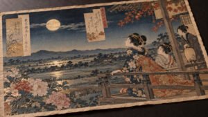
The featured image shows a Kunichika actor print from the Supein Nihonto collection, with blue waterfall passages alongside red, purple, and other colors. It provides a useful example of blue working within a broader palette. It is not presented here as a pure aizuri-e print, and the photograph does not establish the chemical composition of its pigments.
When examining an antique Japanese print, begin with three questions. How does blue relate to the rest of the palette? What specific impression or museum comparison supports the description? Is a statement about its pigments based on documented analysis, or only on its appearance? Keep those answers separate in your notes.
A useful description might identify blue outlines, a blue-dominated background, or a strong contrast between blue and red. A more specific statement naming Prussian blue needs its own support. The Met’s Great Wave study shows what that support can look like: an identified work, examination of its materials, and an explanation of how the evidence relates to printing. This approach makes comparisons more precise without using one color as a shortcut to age, authenticity, or printing order.
CEO of SupeinNihonto, dealer and collector of ancient Japanese art and weapons from Canillo, Andorra.
Contact