October 1, 2026
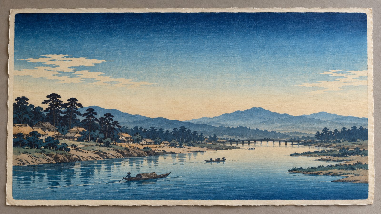
A Japanese woodblock print can suggest an immense sky with remarkably few elements. A dark band of blue gradually becomes lighter. A distant mountain emerges from a softer background. Water changes tone without every ripple being outlined.
These transitions invite us to look beyond the drawing and consider how the image was printed.
Bokashi is the technique of producing graduated colour or tone in Japanese woodblock printing. Instead of a uniformly coloured area, the printer creates a transition between stronger and lighter tones.
Understanding bokashi offers a closer view of the craftsmanship behind ukiyo-e—and of the subtle differences that can exist between impressions of the same design.
Bokashi creates a gradual change in colour intensity rather than a sharply defined boundary.
The British Museum describes it as a printing technique used to suggest depth and atmosphere. In its discussion of Hiroshige’s Sudden Shower at Shōno, the museum explains that the printer controlled the pigment on the woodblock by hand. The resulting gradations were therefore not exactly identical from one impression to another.
The effect can be visually quiet. A viewer may notice the approaching storm or the distance between landscape elements before recognising the graduated printing that helps create that impression.
Bokashi is therefore worth examining both as a technical achievement and as part of the composition.
Bokashi was produced during the printing process.
In a practical explanation published by the British Museum, printmaker Carol Wilhide Justin describes using water, pigment and a brush to create graduated areas on the block. The pigment diffuses towards an area defined by a waterline, producing a transition rather than an evenly coloured field.
The paper receives this prepared colour when it is printed from the block. The same account explains how a baren, the printer’s rubbing pad, transfers pigment by applying pressure to the back of the paper.
This helps explain an important distinction: the carved design establishes the printable forms, while the handling of pigment can influence the tonal result within those forms.
To appreciate the finished image, look at both the outlines and the transitions between colours.
Begin with broad areas where a tonal transition is easy to follow.
Look from the upper edge of the composition towards the horizon.
Does the colour become progressively lighter? Is the transition concentrated in a narrow band, or does it extend across much of the sky?
Then consider its effect on the scene. Does it direct attention downwards, separate distant forms or change the mood of the landscape?
Follow the colour across a river, sea or waterfall.
Observe whether the graduation creates a sense of depth, emphasises a particular area or establishes a contrast with nearby figures and buildings.
Avoid looking only at the darkest passage. The lighter transition may be equally important to the overall effect.
Examine how a mountain or hillside relates to its surroundings.
A change in tone can distinguish one area from another without requiring a heavy outline. Ask where the transition begins and how it affects your perception of distance.
These are useful viewing exercises rather than rules for identifying every technique from a photograph. When the process is uncertain, compare the print with reliable documentation.
Museum examples provide a stronger starting point than assuming that every soft area of colour is bokashi.
The British Museum identifies graduated printing in Hiroshige’s Ferry on the Fuji River, Suruga Province, dating to around 1832. Its exhibition guide specifically points to bokashi in the sky, mountain and water.
The same guide discusses the reddish-pink gradation in an early edition of The Plum Garden at Kameido, showing how the effect contributes to the atmosphere of the scene.
Bokashi was not confined to Hiroshige.
The Metropolitan Museum of Art discusses itabokashi in Kuniyoshi’s Ochanomizu in the Rain. Its catalogue describes ink and colour applied to the block in changing tonalities, with repeated printing used to deepen the gradation.
Together, these examples encourage a more attentive approach: identify the specific print, consult its documentation and then examine how the graduated colour operates within the image.
The design may be the same, while the printed transition differs.
Because graduated pigment was prepared by hand, the effect could vary between sheets. A band might appear broader, a transition softer or a dark passage more pronounced.
The Smithsonian’s National Museum of Asian Art explains that the gradation was inked onto the woodblock by hand for each impression. It identifies sky and water as common areas for these effects.
When comparing two impressions, focus on a corresponding area rather than judging the entire image at once.
Useful questions include:
Differences deserve description before interpretation. A stronger gradient alone does not establish which impression was printed first.
A pale area in an online image should not automatically be labelled intentional gradation.
The photograph shows the present appearance of a particular sheet under particular conditions. Lighting, exposure and image processing can make comparison difficult.
Start by describing what you can see: for example, “a dark blue band that becomes lighter towards the horizon.”
Then compare that area with a documented impression of the same design. If you need to distinguish a printing effect from a condition issue, request clearer photographs and an informed assessment.
Bokashi is a feature to study, not a standalone test of age, authenticity or condition.
Use a simple sequence when viewing a print:
A full-sheet photograph and a close-up of the relevant passage are useful companions. The first explains the composition; the second reveals the transition.
Bokashi encourages us to notice what happens between the drawn lines.
The interest lies in how a transition works within a particular image: softening a horizon, shaping a stretch of water or giving a sky its visual weight.
For broader background, explore our guide to ukiyo-e history, artists and Japanese woodblock prints.
When viewing the ukiyo-e collection at Supein Nihonto, take time to examine graduated colour alongside the subject and composition. These passages offer another way to appreciate the craftsmanship of Japanese printmaking.
Bokashi refers to graduated colour or tone. It creates a transition between stronger and lighter areas rather than a uniformly coloured field.
Yes. The printer prepared graduated pigment on the woodblock before transferring it to paper. The effect depended on the handling of colour during printing.
Skies, water and landscape passages are useful places to begin. Look for gradual tonal changes and compare them with documentation for the specific design.
Yes. The graduated colour was prepared by hand, so its width, intensity and transition could vary between impressions.
No. A darker passage alone does not establish printing order. Comparisons should consider the documented design, printing characteristics, condition and photographic differences.
No. Museum collections document its use by other artists, including Kuniyoshi. Hiroshige provides well-known examples, but the technique was not exclusive to him.



CEO of SupeinNihonto, dealer and collector of ancient Japanese art and weapons from Canillo, Andorra.

Contact