October 14, 2026
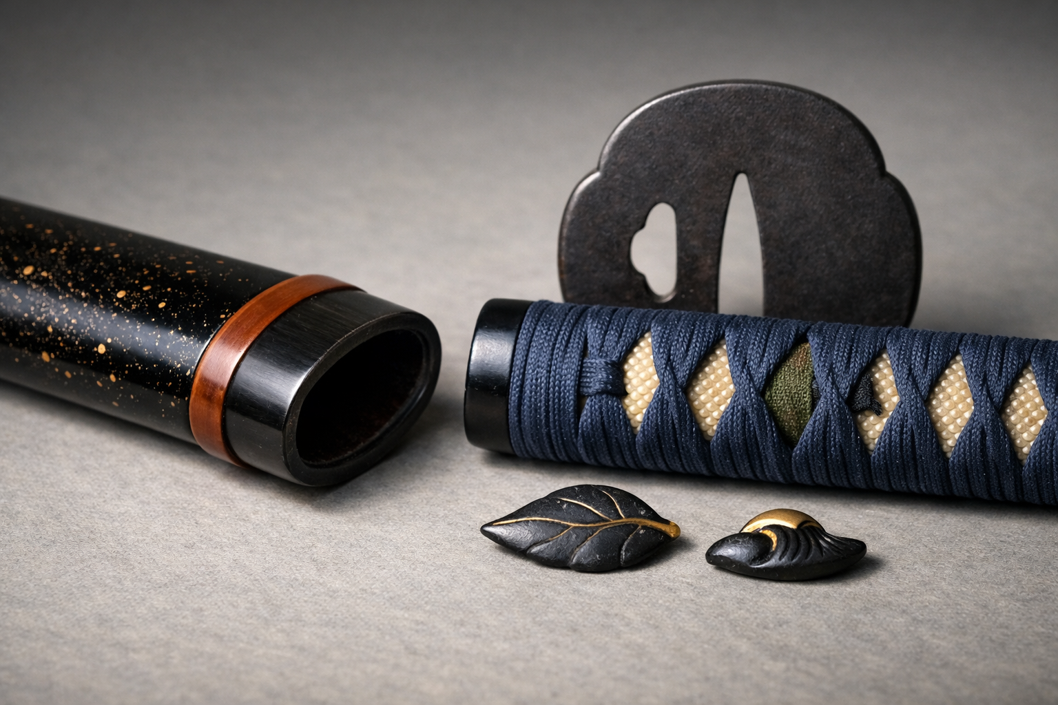
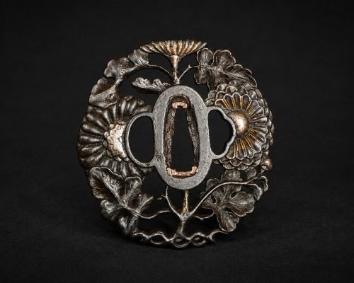
Koshirae (sword mountings) are sometimes discussed as though every metal, colour and motif were a code with a single, fixed meaning. In practice, they are better approached as a form of material culture: carefully made, often highly personal, and shaped by workshop practice, taste, fashion, and circumstance. This article outlines commonly described conventions in koshirae symbolism—while separating what can be observed (materials, finishes, motifs, condition) from what must remain interpretive (status, seasonality, intention).
Koshirae are not merely protective housings for a blade. They are also objects seen at close range: worn, handled, presented, and kept in rooms where guests could notice details. Because they sit at the intersection of utility and display, they can carry social signals—even when those signals are not straightforward to decode today.
For much of Japanese history, a sword was part of an ensemble. Mountings could harmonise with clothing, accessories, and occasion. In this sense, samurai sword mountings can be considered alongside other forms of dress: they can suggest restraint, formality, or an appetite for visual play. Yet it is important to avoid the leap from “looks formal” to “must belong to a particular rank”. A sober, dark set of fittings might reflect taste, practicality, local fashion, or the demands of wear as much as any social position.
A useful collector’s habit is to separate first impressions from descriptions. “Subdued iron fittings with minimal gilding” is an observation; “high-ranking austerity” is an interpretation that requires context we often do not have.
Most koshirae are collaborative objects. Lacquerers, metalworkers, and wrap specialists (tsukamaki-shi) each contributed skills, and each worked within the materials and techniques available to them. A patron could commission coherent, theme-driven work; equally, a workshop might steer choices based on proven designs, stock components, and what would wear well. The result is that the same motif or material may appear across different contexts, sometimes with different emphases.
This is one reason that repeated patterns—certain ground textures, familiar wave designs, popular plant motifs—should not be assumed to be “standard meanings”. They might simply be good solutions, aesthetically and technically, that appealed to many clients.
Symbolism is rarely universal. Meanings can be time-bound, regionally inflected, or personal. Some motifs carry broadly auspicious associations in Japanese art, but even then the tone can range from solemn to witty. Where a fitting invites interpretation, cautious phrasing helps: “often described as…”, “commonly read as…”, “may allude to…”. This reduces the risk of overstating what the object itself can guarantee.
It also keeps the focus where it belongs: on careful looking and well-structured notes that remain useful even when an interpretive fashion changes.
Materials are the first layer many collectors notice: the colour-temperature of a metal, the depth of a lacquer, the sheen of a wrap. They can reflect budget, availability, workshop preference, and intended wear. They can also mislead if treated as a simple hierarchy.
In fittings, iron often reads visually as sober and direct, especially when finished with a dark patina and minimal decoration. Soft-metal fittings—such as shakudō (a copper-based alloy typically finished to a deep blue-black patina), shibuichi (often grey), silver, and gilded surfaces—can present a more luminous, decorative surface. It is tempting to treat these materials as a ladder of status, but the reality is more mixed.
Some pairings are commonly seen: dark iron with fine carving; shakudō with subtle nanako-like textures and gold highlights; silver used for crisp contrast against lacquer. None of these, however, is a universal rule of rank. They are conventions of taste and technique, and they vary with period, place, and the preferences of a commissioner.
A collector-friendly approach is to describe materials and finishes precisely: “dark patinated soft-metal fuchi-kashira with gilt details” says more than “high-status mounts”, and avoids implying codified regulations you cannot document from the object alone.
Lacquer (urushi) on the saya (scabbard) is a world in itself: glossy black, translucent browns and reds, textured finishes, and sprinkled effects. From a practical standpoint, lacquer is a protective coating; from an aesthetic standpoint, it offers depth and controlled reflectivity. Wear patterns can indicate handling and storage more reliably than social meaning.
Look for where rubbing occurs: at the koiguchi (mouth), around suspension points, or along edges that contact the body. Patchy gloss, small chips, and smoothing at touchpoints can suggest use and repeated draw-and-sheath—without telling you who used it or under what rule-set. Conversely, an immaculate lacquer surface may indicate careful storage, later refurbishment, or simply light use.
When documenting, note the finish type (gloss, matte, textured), the colour impression under neutral light, and where wear concentrates. That information supports later comparison and conservation decisions without drifting into ungrounded claims.
Tsukamaki (handle wrapping) involves both material and method. Silk ito (wrapping cord) is commonly encountered and can range from matte to lustrous depending on weave and dye. Leather ito, often sturdier in appearance, can suggest an emphasis on grip and durability, though it also appears in visually refined contexts. Some wraps use fibres or cords that read as pragmatic or intentionally rustic.
Rather than assigning a fixed social meaning to wrap material, treat it as part of a broader set of choices: the colour, the tightness and evenness of the wrap, the placement and scale of the menuki (grip ornaments), and the overall harmony with the fuchi-kashira (collar and pommel) and saya. Note also that rewrapping can be done in later periods, sometimes to refresh worn ito or to suit a new owner’s taste. A seemingly “old-fashioned” wrap is not, in itself, reliable evidence for dating.
Seasonality is a recurring thread in Japanese decorative arts. In koshirae it can appear on menuki, fuchi-kashira, kozuka and kogai, or in lacquer designs on the saya. Seasonal themes can be direct (a clearly rendered flower) or oblique (a pattern associated with a poem or place-name).
Spring motifs frequently include blossoms—commonly cherry or plum—alongside grasses and young leaves. Summer can bring water imagery: waves, ripples, and other cooling associations. These are not only “pretty designs”; they can suggest cultivated taste, an interest in classical themes, or simply a preference for a lively surface.
For collectors, the key is to describe what you actually see. If a motif is ambiguous, record its features: number of petals, leaf shape, whether it appears with buds or fruit, whether water is stylised as repeating arcs or as a more naturalistic flow. This keeps your notes useful even if you later revise “cherry” to “plum”, or decide the waves are a general water pattern rather than a specific literary reference.
Autumn themes often feature grasses (such as susuki, pampas grass), maple leaves, and imagery of wind or scattered foliage. Winter motifs might include snow on branches, bare reeds, or quieter compositions with strong negative space. Such designs can feel restrained, but restraint is not the same as status; it may be seasonal taste, a preference for minimalism, or a deliberate counterpoint to more ornate clothing.
When describing, consider both motif and treatment: is the surface crowded or spare, are forms outlined crisply or dissolved into texture, and are highlights used sparingly or emphatically? These are the choices that shape a “seasonal” mood, even when the motif itself is not easily named.
Some of the most interesting koshirae are those that refuse literal reading. Japanese visual culture makes room for allusion: a single plant might stand in for a remembered poem; an object might be chosen for a pun based on sound; a pairing of motifs might evoke a place or story known to the commissioner’s circle.
Here, caution is essential. Without supporting documentation, it is easy to project a clever interpretation onto a design that may have been chosen simply because it looked good or because the workshop had a successful pattern. If you suspect an allusion, record it as a possibility: “may allude to…”, “possibly a rebus for…”. That is far more defensible than presenting a literary reading as fact.
Status can be present in koshirae, but it is rarely a single switch that flips from “low” to “high”. Display, discretion, and formality are layered, and they interact with local rules, house preferences, and the realities of what could be worn where.
Some mountings are visually quiet: dark iron, limited contrast, minimal gilding. Others are designed to catch light: polished soft metals, gold details, elaborate carving, and lacquer that reads as deep and reflective. It is reasonable to say that certain materials and techniques required greater expense and skill. It is not safe to say that expense equates neatly to rank, or that quietness equates to “higher” taste.
Collectors sometimes find it helpful to describe “visual temperature” and “contrast”: is the set predominantly dark and matte, or bright and reflective? Is decoration concentrated in one area (for example, prominent menuki) or distributed across many parts? Such language captures the social effect without claiming a specific social position.
Across time and geography, styles circulated. Certain domains and families are described in the literature as having developed preferences, and workshops developed recognisable approaches. However, unless a koshirae comes with documentation, it is wise not to pin it to a particular house or locality on style alone. Similar tastes can arise in different places, and later remounting can introduce elements from other contexts entirely.
If you are comparing pieces, do so with humility: note similarities, but keep conclusions provisional. “Comparable to examples that favour dark patinated fittings with discreet gold highlights” is a useful observation; “this must be a specific domain style” is a claim that typically requires external evidence.
Regulations and sumptuary expectations did exist in various forms, and courtly contexts had their own conventions. Yet these changed over time, varied by place, and were not always followed in the same way. For the collector, the practical outcome is simple: do not treat a single feature—gold colour, a particular alloy, a specific motif—as proof of permission or prohibition.
When discussing regulation at all, keep it general and conditional: “in some contexts, restrictions and expectations shaped what could be worn” is fair; “this alloy proves formal permission” is not.
Ito colour is one of the most discussed aspects of koshirae, partly because it is immediately legible to modern eyes. Yet it is also one of the most treacherous, because it is affected by fading, rewrapping, lighting, and the very human tendency to see colour as a fixed sign.
Black and dark brown wraps are frequently encountered and often read as practical: they can hide grime, sit comfortably with dark fittings, and appear appropriately restrained in many settings. Indigo and other blue tones also appear regularly, sometimes reading as understated, sometimes as deliberately vivid depending on saturation and contrast with the samegawa (rayskin) beneath.
White ito is visually striking, but it is also unforgiving: it shows wear and staining readily. Where it appears, it may reflect a preference for crisp contrast, a desire for brightness in an otherwise subdued set, or use in more controlled settings. None of these possibilities is automatic. As always, the safest method is to describe the colour and condition, then note any plausible readings as contingent.
Purple is often described in literature as having courtly or ceremonial associations, and collectors frequently encounter the idea that purple “means high status”. A more cautious stance is that purple can carry elevated associations in certain contexts, but colour meaning is not uniform across all times and places, and practical factors (availability of dyes, workshop habit, later rewrap) intervene.
Crimson and other reds can feel bold or festive to modern viewers, and they can create strong contrast with black lacquer and dark fittings. Gold-toned ito or wraps that incorporate metallic threads may read as conspicuously decorative, but they also appear in curated, harmonious compositions where the effect is controlled rather than loud.
For catalogue descriptions, consider adding a short note that acknowledges uncertainty: “purple-toned ito (appearance may be affected by fading)” or “red-brown ito; hue difficult to judge from photographs”. This is not pedantry; it is good documentation.
Two wraps that were originally similar may now look very different. Dyes fade; oils from hands darken fibres; lacquer reflection shifts surrounding colour; and cameras can push indigo towards black or purple towards blue. Even the same wrap can look different under warm indoor light versus cool daylight.
If you photograph ito for reference, include at least one image under neutral light and, where possible, a colour reference card. If that is impractical, at minimum record the lighting conditions and whether your camera’s white balance was automatic. These small notes help avoid later confusion when comparing your photographs to another seller’s or to a museum image.
Menuki are small ornaments placed beneath the wrap, originally with functional and structural roles and later strongly associated with decoration. They are also a prime site for layered meaning: protective themes, seasonal references, personal emblems, and humour.
Many menuki depict animals or figures that are widely understood in Japanese art to be auspicious, protective, or associated with virtues. Even so, it is unwise to insist on a single fixed meaning for a given creature across all contexts. The same animal may be chosen for family associations, a pun, a reference to a story, or simply because the design suited the hand.
When recording menuki symbolism, start with concrete description: animal type (if clear), posture, accompanying elements (clouds, waves, plants), and metal and finish. If you add interpretation, keep it conditional: “often treated as auspicious”, “may suggest protection”, “possibly chosen for personal resonance”.
Some menuki depict everyday objects—tools, fans, writing implements, gourds, or small bundles—that may allude to professions, leisure pursuits, or wordplay. Such designs can feel intimate: a quiet nod to learning, to travel, or to a household interest. They can also be playful in the way they hide in the wrap and reveal themselves only on close inspection.
Because these motifs can be subtle, photographs taken obliquely (raking light) can be more informative than front-on shots. For notes, sketching the outline and recording any inscriptions on associated fittings (where present) can help future identification—without forcing a narrative too early.
Menuki are also physical: their placement affects the feel of the tsuka in the hand. Placement varies by style and workshop practice, and sometimes by the wearer’s preference. A menuki that appears oddly large or uncomfortable might indicate later changes, a mismatched set, or simply a design that prioritised visual impact over ergonomics.
When assessing, avoid moralising about “correct” placement unless you are discussing a specific, well-documented convention. A more useful question is: does the placement look intentional and consistent with the wrap, or does it look like an accommodation made during a rewrap?
Two mounting forms often discussed in social terms are aikuchi and handachi. Both can indeed suggest certain contexts of wear, but neither should be treated as a single-purpose category with a fixed social meaning.
An aikuchi mounting is characterised by the tsuka (hilt) meeting the saya without the usual protruding tsuba (guard), creating a flush junction. Aikuchi are frequently described in connection with indoor settings and more compact presentation, and they appear on various blade types and in different contexts. The absence of a tsuba changes both the silhouette and the way decoration is distributed—attention may concentrate on the fuchi, kashira, and lacquer work.
Where collectors sometimes go wrong is in treating aikuchi as “strictly ceremonial” or restricted to one environment. It is safer to say: aikuchi are often discussed as suitable for certain situations, but individual examples should be described on their own terms.
Handachi mountings blend aspects associated with tachi-style hardware with the manner of wearing more typical of katana. Visually, you may see hybrid cues in the fittings and suspension-related elements. The overall impression can be of deliberate archaism or of stylistic blending, depending on the example.
For documentation, focus on what is physically present: which hardware elements appear tachi-like, how the mounts are arranged, and whether the set looks coherent as a unified design. Avoid treating “handachi” as a date stamp; mounting styles can be revived, imitated, or assembled later.
Both aikuchi and handachi can function as hints about intended presentation, but hints are not proofs. A form can be chosen for taste, for comfort, for tradition, or because it suited an existing blade. When you describe these forms, let the terminology do the work—define the type, list the features—and keep any social reading tentative.
One of the biggest obstacles to confident symbolic reading is the composite nature of many surviving koshirae. Parts wear out, tastes change, and components get swapped. Symbolism that once formed a coherent theme can be disrupted—or a theme can be created later from disparate elements.
Fuchi-kashira, tsuba, menuki, and small accessories are commonly replaced or exchanged. A damaged kashira might be substituted; a favourite tsuba might move from one mounting to another; menuki might be changed for visual appeal. None of this requires deception; it is simply one way functional objects survive across generations.
The result is that a seasonal motif on the menuki may not match the lacquer theme on the saya, or the metalwork style may diverge across components. Rather than forcing a single interpretive story, record the mismatch as a fact worth noting.
A fully matching set—where motifs, metal finishes, and workmanship align across fittings—can be compelling. Even then, it is better to describe “appears coherent” than to claim original unity unless documentation supports it. Conversely, “married” parts (assembled from different sources) are common and can still be aesthetically pleasing and historically interesting.
For collectors, the practical question is: does the set present a consistent visual language, or are there clear jumps in style, patina, or motif? List those observations calmly. They are valuable for future research and for transparent cataloguing.
The most robust approach is simple documentation. Photograph each component: tsuba front and back, fuchi and kashira from multiple angles, menuki both sides if possible, and the saya details. Write notes that separate description from speculation. Later, if you consult references or compare to curated examples, you can revisit interpretations without rewriting your primary record.
Interpreting koshirae can be enjoyable, but good collecting practice begins with careful description. This protects you from overconfidence and makes your records useful to others—curators, polishers, restorers, and future owners.
Start with a parts checklist and consistent terminology. At minimum, record: saya (scabbard), tsuka (hilt), tsuba (guard, if present), fuchi (collar), kashira (pommel), menuki (grip ornaments), samegawa (rayskin), seppa (spacers), and the presence of any kozuka/kogai elements if applicable. For tsukamaki, note wrap style if you know it, but do not guess; “wrap style uncertain” is perfectly acceptable.
This vocabulary-first method improves searching and comparison. It also helps avoid a common error: trying to interpret symbolism before one can even name the parts where the motifs appear.
To reduce colour misreads, use neutral daylight when possible and avoid mixed lighting. Take one wide shot for overall harmony and several close-ups for texture. If the lacquer is glossy, move the light source rather than relying on flash; reflections can obscure surface detail and shift colour perception.
For metals, raking light reveals carving and texture. For ito, photograph both in shade and in gentle light to show weave and sheen. If you later share images internationally, remember that different screens render colour differently; your written notes remain an important anchor.
Model captions that distinguish observation from interpretation. Examples:
These statements remain useful even if your later reading of the motif changes. They also avoid implying fixed status or dating conclusions that the koshirae alone cannot reliably support.
Because meaning is context-dependent, the best way to learn is comparative looking: many examples, across different mounting types and levels of formality. Build a mental library of shapes, finishes, and motif treatments, and let that inform cautious interpretation.
Start by reviewing the major mounting types and their diagnostic features. Being able to name forms—such as aikuchi and handachi—helps you search more accurately and communicate clearly with other collectors. Even when you do not interpret meaning, you can still describe form precisely, which is often more valuable.
A single koshirae can be unusual for many reasons: later alteration, workshop experimentation, regional fashion, or personal taste. Comparing multiple examples reduces the temptation to treat one specimen as a rule. Keep notes on what repeats and what varies: metal choices, lacquer palettes, motif pairings, and wrap colours.
Curated sets—whether in publications, museum catalogues, or specialist discussions—can help you learn how experienced writers distinguish description from interpretation. Look especially for examples where authors explain uncertainty openly, and where multiple plausible readings are presented without forcing a single conclusion.
No. While purple is often described as courtly, colour meanings varied by time, place and availability. Fading and rewrapping also complicate readings.
Caution is essential. Mountings are frequently remixed over generations. Describe what is present and avoid firm dating from fittings alone.
Aikuchi are described in contexts that include courtly or indoor wear, but usage was not uniform. Treat any single-purpose claim as context-dependent.
Some themes are commonly read as auspicious, yet meanings can be playful or personal. Document motifs first; interpret with restraint.
Lighting, camera white balance, patination and fading shift perceived hue. Compare shots under neutral light and note any colour cast.
To see terminology and forms applied across real examples, browse Japanese Koshirae: The Art and Function of Authentic Samurai Sword Mountings for a wide, contextual view.
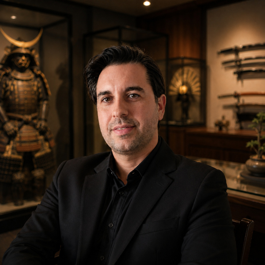
CEO of SupeinNihonto, dealer and collector of ancient Japanese art and weapons from Canillo, Andorra.
Contact