October 14, 2026
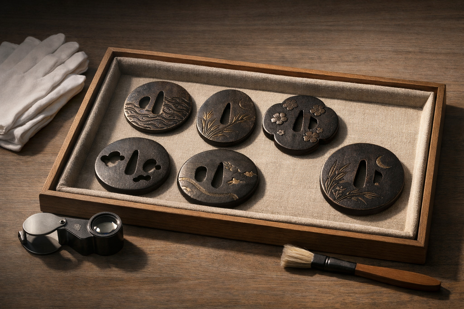
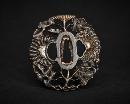
A tsuba (sword guard) rewards slow looking. It is a practical fitting, but also a compact artwork in which material, technique and motif carry deliberate choices. The aim of “reading” a tsuba is not to jump to a maker, school or date from a single trait. It is to observe what is demonstrably present—construction, surface, tooling and iconography—and then to form cautious, culturally informed interpretations about taste, context and use.
This guide focuses on tsuba motifs, how designs are built, and how broad stylistic lineages are discussed in study circles. It is interpretive rather than attributive: nothing here should be taken as authentication, an assessment of signature legitimacy, or a substitute for expert verification and documentation.
A tsuba sits between blade and grip, protecting the hand and stabilising the mounting. Because it is handled, mounted and sometimes altered over time, it can show evidence of use and remounting. Because it is also a canvas for metalwork, it can carry design logic and the owner’s preferences. Reading it well means holding both realities together: functional object and crafted image.
Using correct terms helps you describe what you see without overreaching.
What you can state with confidence is what is physically observable: material (iron or soft metal), presence of inlay, openwork (sukashi), types of carving, the motif’s subject matter, and signs of alteration (such as added fitting pieces). You can also note workmanship traits—crispness of line, control of negative space, or layering of metals—without turning those observations into a school label.
What you cannot responsibly infer from appearance alone includes maker, precise period, region, authenticity of a signature, or ownership history. Even where a motif strongly evokes a known tradition, similar designs were repeated, revived, copied and adapted. Treat symbolism as a set of likely readings, not a single correct answer; treat “school” as a comparative framework, not a conclusion.
Motifs are rarely random. They may signal seasonal taste, auspicious wishes, literary learning, or simple visual pleasure. Yet motif meanings can shift with context: a crane might be read as longevity, but also as a poetic reference; waves might be resilience, but also a scene-setting device. A useful habit is to describe first (“a pair of cranes among reeds, with waves at the lower edge”), then interpret (“this may suggest longevity and a waterside seasonal mood”).
Animals tend to carry a blend of moral, protective and poetic associations. Common examples include:
When reading such subjects, note whether the treatment is naturalistic, stylised, or emblematic. A boldly simplified creature in sukashi will communicate differently from a densely modelled figure in relief with inlay highlights.
Plant motifs often act as seasonal cues and carriers of virtue. A few recurrent groupings:
Pay attention to what is omitted. A few reeds and a line of waves can be enough to evoke an entire shoreline; negative space is part of the scene.
Some tsuba motifs draw directly on shared cultural repertoires:
In all cases, avoid turning motif recognition into biography. A tsuba can quote culture without recording a life.
Technique is not merely “how it was made”; it is part of the grammar of the design. Two tsuba with the same subject—say, waves and a dragon—can feel entirely different depending on whether the maker relies on openwork, line engraving, raised relief, or coloured inlay. When you describe technique precisely, your interpretations become more grounded and less dependent on guesswork.
Sukashi is openwork piercing: the design is created by removing material so that light and background become part of the motif. Reading sukashi is largely about silhouette logic—how positive and negative space balance each other.
Because sukashi appears across many regions and eras, it is a poor single marker for origin. It can, however, reveal priorities in the work: graphic simplicity, airy elegance, or delicacy.
Carving is often layered, combining different approaches for emphasis.
Rather than asking “is this good?”, ask “what is the carving trying to do?”. Some designs aim for restraint; others aim for narrative clarity. Both can be successful on their own terms.
Inlay introduces colour and contrast, but it also introduces hierarchy: what is inlaid is often what the maker wants you to notice.
When reading inlay, also look for wear patterns. Soft-metal highlights can diminish with handling and cleaning; absence of bright colour does not necessarily mean it was never there, but it should prompt careful, non-assumptive observation.
Material choice shapes both aesthetics and how a tsuba ages. Iron can offer depth through texture and patina; soft metals can offer refined colour and detail. Mixed-metal work often aims to balance these qualities. Reading material is partly visual and partly tactile (within safe handling practices): weight, temperature and surface response to light can all be informative.
An iron plate is not a blank. It may show deliberate surface character: subtle hammer work, controlled textures, or areas polished to a soft sheen. Iron also develops patina and controlled rust colouration that can be both protective and aesthetic. When observing iron:
Resist the temptation to equate “heavier” with “older” or “more martial”. Plate thickness and mass are design choices and mounting responses as much as they are functional decisions.
Shakudo is a copper–gold alloy known for a deep blue-black patina achieved through controlled patination. A shakudo ground can make gold, silver and copper accents appear brighter by contrast, while still reading as restrained rather than flashy.
When you encounter a shakudo tsuba, observe how the patina behaves in high points and recesses, and whether the colour reads consistently across the ji. Many appreciated examples feel “quiet” at first glance, revealing detail gradually as light shifts.
Mixed-metal palettes—iron with soft-metal inlay, or soft-metal plates with multi-colour details—can create a visual hierarchy:
Try to read colour as a compositional device. Ask what the brightest metal is pointing to: the narrative centre, the symbolic “wish”, or simply the balance of the design.
Collectors often use lineage names as shorthand. Used carefully, they help you compare tendencies: preferred motifs, typical layouts, and common technique combinations. Used carelessly, they become labels applied too quickly. The following notes are deliberately broad and should be treated as orientation only.
In discussion, Shoami tsuba is often associated with variety: a wide range of motifs and techniques, and designs that aim for balanced, readable compositions. You may see:
Because “Shoami” can be used broadly in the marketplace and in casual description, treat it as a prompt for comparison rather than a conclusion. If you find yourself reaching for the label, pause and list the actual features you see.
The term Goto school is closely associated with kinkō (soft-metal) aesthetics: refined workmanship, careful modelling, and controlled surfaces. In broad, non-attributive terms, discussion often highlights:
These are aesthetic tendencies, not proof of lineage. Soft-metal refinement appears in many traditions, and later works can emulate earlier tastes. If a piece carries a signature or mark, that is a separate problem requiring specialist verification and documentation.
Nanban tsuba is commonly discussed in relation to cosmopolitan or foreign-inspired design elements. As visual cues (not proofs), you may encounter:
When reading nanban-style elements, focus on design structure: how border and field interact, how the rim functions as a frame, and how pattern density affects legibility from different angles.
A tsuba is part of a mounting system, and mountings are choices. Still, the same tsuba can be reused, re-fitted or reinterpreted across time. It is therefore safer to speak in terms of what it may suggest rather than what it “proves”. Treat these observations as hypotheses to be tested against the whole mounting, documentation and comparative examples.
At a glance, ornate soft-metal work can feel “dressy”, while robust iron plates can feel “practical”. That intuition can be useful, provided you keep it tentative.
Yet crossovers are common. Iron can be finely worked; soft-metal can be sturdy. The key is not the material alone, but the overall approach: how vulnerable the details are, how exposed the high points are to wear, and how the design anticipates handling.
Several practical features can inform your reading without drifting into dating or attribution:
When you note such cues, record them neutrally. “Sekigane present on both sides of the nakago-ana” is a useful observation. Causal claims about age or rank from such details alone are not.
Some tsuba include a mon (family crest), zodiac animal, or repeated personal theme. These elements can feel intimate, but they still require caution.
A responsible stance is to say: “this motif could have resonated personally”, rather than “this belonged to someone of a particular family” or “this indicates rank”.
Inscriptions can be fascinating: they promise names, places, dedications and stories. They also introduce risk, because marks can be copied, misread, or added later. Treat inscriptions as study objects in their own right, and avoid relying on them without corroboration.
A mei is a maker’s signature; a kao is a stylised mark. When present, record them carefully (location, orientation, stroke character) and compare with reliable references. But keep two boundaries clear:
In practical terms: photograph inscriptions under raking light, avoid chalking or rubbing, and seek expert verification supported by documentation if the reading matters to your study.
Short texts, dedicatory phrases or cartouches can add a literary or commemorative layer. They may:
At the same time, text can be misinterpreted, especially when abbreviated or stylised. Treat it as an invitation to research rather than as final proof of provenance or date. Where possible, corroborate readings with multiple sources and knowledgeable readers.
No tsuba exists outside time. Mountings change; tastes change; objects are cleaned, repaired and sometimes reworked. These changes can complicate interpretation, but they can also form part of the object’s history as a used fitting. Reading alterations sensitively helps you avoid attributing later interventions to original design intent.
Common mounting-related changes include:
These are not “faults” in themselves, but they do affect how you read the design. A plugged aperture can change compositional balance; a shim can indicate that the tsuba was made to work, not merely to be looked at.
Patina is one of the most persuasive elements of a tsuba’s visual coherence. Interruptions can occur through cleaning, polishing, corrosion removal, or repair. When assessing surface unity:
The goal is not to condemn an altered piece, but to avoid mistaking later surface effects for the original aesthetic.
Skill in reading a tsuba is built the same way connoisseurship is built in other fields: repeated exposure, accurate language, and careful comparison. Progress often comes from disciplined habits rather than from memorising lists of motifs or schools.
A practical routine for collectors and students:
Over time, you will notice patterns: which layouts feel stable, how certain techniques produce certain moods, and how motif choices are guided by seasonality and poetic convention.
As you develop your eye, keep returning to first principles: function, form and verifiable features. Build a small personal reference set of images and notes, and revisit the same pieces after you have studied more examples; what seemed “simple” at first often becomes more articulate with experience.
They often reference virtues, seasons, literature or protection (for example, cranes for longevity, waves for resilience). Treat meanings as interpretive, not definitive.
No. Sukashi is openwork used across regions and eras. It shows design intent and skill but does not by itself prove school or date.
Compare broad traits described in study guides, but formal attributions require expert assessment and documentation. Avoid assuming from style alone.
Features may suggest intended use or taste, but age, maker and status need holistic study and independent verification.
Shakudo is a gold–copper alloy that develops a deep blue-black patina prized for subtle contrast and refined surface.
Continue your study with our overview of tsuba fundamentals, then browse our in-depth appreciation article on antique tsuba. When you feel prepared, consult our guide on choosing an original tsuba—always keeping interpretation and attribution distinct.
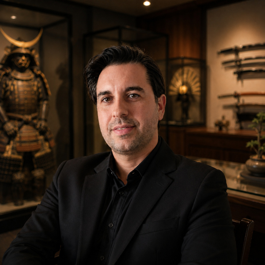
CEO of SupeinNihonto, dealer and collector of ancient Japanese art and weapons from Canillo, Andorra.
Contact